

library(readxl)
library(ggplot2)
library(ggrepel)
# 1. 데이터 불러오기
data <- read_excel("D:/mydata/PCA용.xlsx", sheet = "Sheet1")
# 2. 변수 선택 및 결측치 제거
df <- data[, c("이름", "스윙률", "타구속도")]
df <- na.omit(df)
# 3. 이름 벡터
names_vec <- df$이름
# 4. 정규화 (평균 중심화 및 표준화)
X_scaled <- scale(df[, c("스윙률", "타구속도")], center = TRUE, scale = TRUE)
# 5. PCA 수행
pca_result <- prcomp(X_scaled)
# 6. 고유벡터를 원래 좌표계로 역변환
sdevs <- apply(df[, c("스윙률", "타구속도")], 2, sd)
center <- colMeans(df[, c("스윙률", "타구속도")])
rotated_vectors <- sweep(pca_result$rotation, 1, sdevs, "/") # 역변환
# 🔴 화살표 길이 확대 계수
arrow_scale <- 20
# 7. 화살표 좌표 생성
arrow_data <- data.frame(
x_start = center[1], y_start = center[2],
x_end = center[1] + rotated_vectors[1, 1] * arrow_scale,
y_end = center[2] + rotated_vectors[2, 1] * arrow_scale,
PC = "PC1"
)
arrow_data <- rbind(arrow_data, data.frame(
x_start = center[1], y_start = center[2],
x_end = center[1] + rotated_vectors[1, 2] * arrow_scale,
y_end = center[2] + rotated_vectors[2, 2] * arrow_scale,
PC = "PC2"
))
# 8. 이름 추가
df$이름 <- names_vec
# 9. 시각화
ggplot(df, aes(x = 스윙률, y = 타구속도)) +
geom_point(color = "steelblue", size = 3) +
geom_text_repel(aes(label = 이름), size = 4) +
geom_segment(data = arrow_data,
aes(x = x_start, y = y_start, xend = x_end, yend = y_end, color = PC),
arrow = arrow(length = unit(0.25, "inches")), size = 1.1) +
geom_text(data = arrow_data, aes(x = x_end, y = y_end, label = PC, color = PC),
vjust = -1, size = 5) +
labs(title = "확대된 PCA 주성분 축 in 원래 좌표계 (스윙률 vs 타구속도)",
x = "스윙률",
y = "타구속도") +
theme_minimal() +
coord_equal()
---------------------------------------------------------
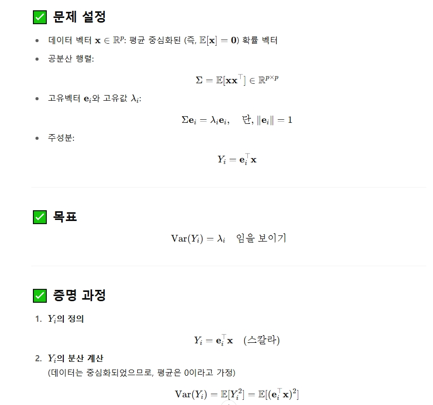
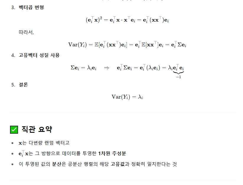
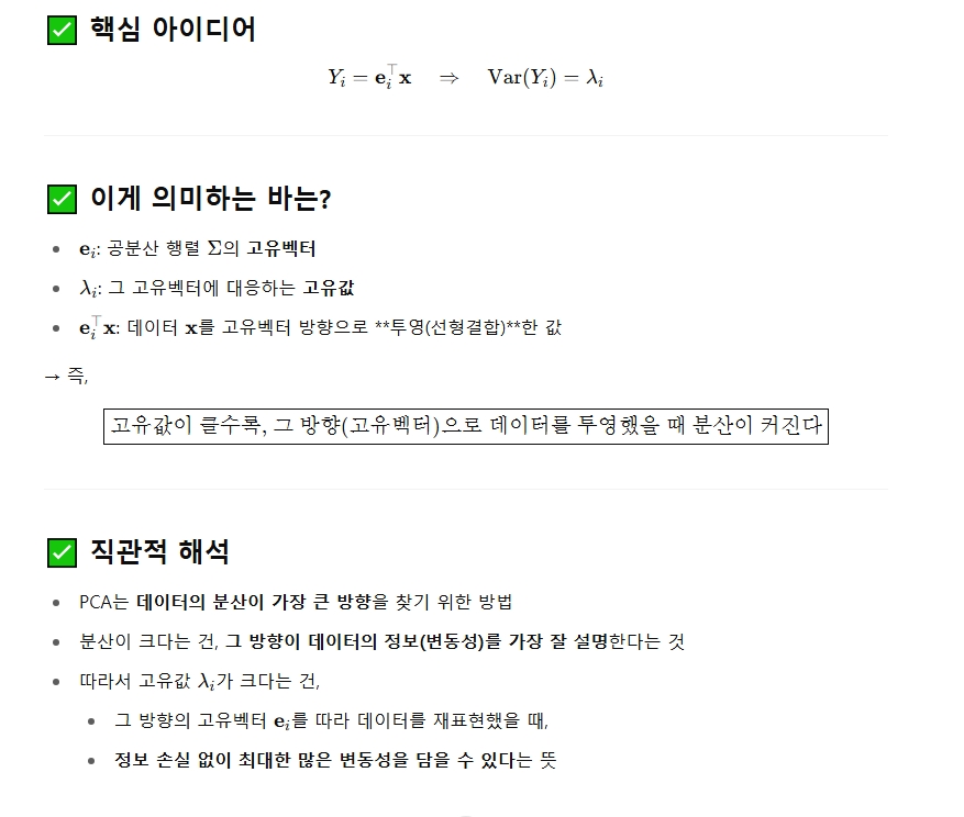
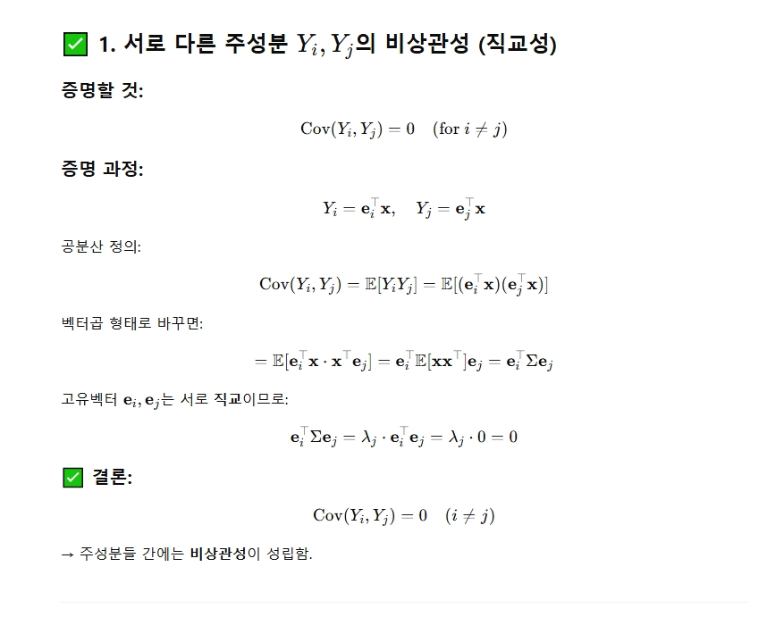
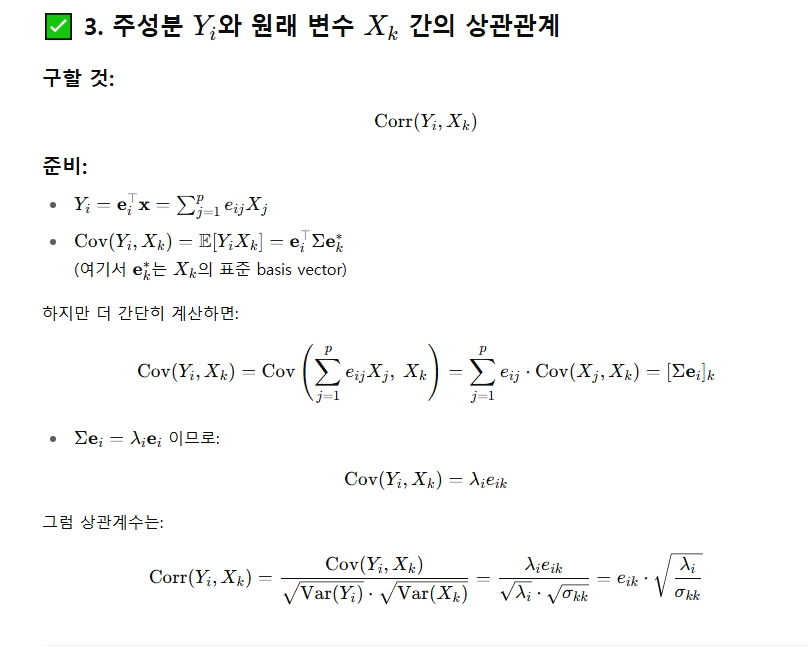
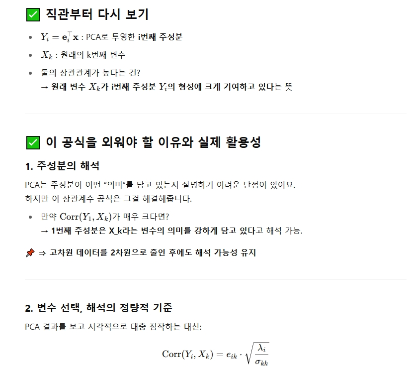
1. Var(Yi)의 의미
----------------------------------------------------------------
2. 기타 수식들에 대한 정리


# 필요한 패키지 설치 및 불러오기
install.packages("readxl")
install.packages("ggplot2")
install.packages("ggrepel")
install.packages("plotly")
library(readxl)
library(ggplot2)
library(ggrepel)
library(plotly)
# 1. 데이터 불러오기
data <- read_excel("D:/mydata/PCA용.xlsx", sheet = "Sheet1")
# 2. 사용할 변수 선택 및 결측 제거
df <- data[, c("이름", "스윙률", "컨택률", "타구속도")]
df <- na.omit(df)
# 이름 벡터 따로 저장
names_vec <- df$이름
features <- df[, c("스윙률", "컨택률", "타구속도")]
# 3. PCA 수행 (정규화 포함)
pca_result <- prcomp(features, center = TRUE, scale. = TRUE)
# 4. PCA 결과 요약 출력
summary(pca_result) # 분산 비율 등
pca_result$rotation # 고유벡터 (로딩)
pca_result$sdev^2 # 고유값 (분산)
# 5. PCA 결과 데이터프레임에 추가
pca_scores <- as.data.frame(pca_result$x[, 1:2])
pca_scores$이름 <- names_vec
# 6. 2차원 PCA 시각화
plot2d <- ggplot(pca_scores, aes(x = PC1, y = PC2)) +
geom_point(color = "blue", size = 3) +
geom_text_repel(aes(label = 이름), size = 4) +
labs(title = "PCA (2D Projection)", x = "PC1", y = "PC2") +
theme_minimal()
print(plot2d)
# 7. 3차원 원본 변수 시각화 (plotly)
plot3d <- plot_ly(df, x = ~스윙률, y = ~컨택률, z = ~타구속도, text = ~이름,
type = "scatter3d", mode = "markers",
marker = list(size = 4, color = 'steelblue')) %>%
layout(title = "3D Plot of Original Variables",
scene = list(xaxis = list(title = "스윙률"),
yaxis = list(title = "컨택률"),
zaxis = list(title = "타구속도")))
plot3d
------------------------------
# 데이터 프레임 생성
scores <- data.frame(
국어 = c(78, 54, 34, 68, 41, 54, 64, 98, 36, 71),
영어 = c(38, 56, 67, 40, 89, 56, 44, 28, 78, 47),
수학 = c(49, 36, 77, 48, 42, 41, 48, 52, 50, 42),
과학 = c(50, 70, 37, 60, 44, 65, 61, 37, 50, 56)
)
# 주성분 분석 수행
pca_result <- prcomp(scores, scale. = TRUE)
# 주성분 로딩 확인
print(pca_result$rotation)
# 주성분 점수 확인
print(pca_result$x)
'통계학' 카테고리의 다른 글
| 고유값과 고유벡터의 대수적 성질 (0) | 2025.05.28 |
|---|---|
| 주성분분석 2 (0) | 2025.05.27 |
| Box-Cox 변환 (0) | 2025.05.19 |
| 마할라노비스거리를 이용한 정규성 검정 (0) | 2025.05.18 |
| 정규성 검정 QQ plot (0) | 2025.05.15 |


